
I decided to play Fix It Fridays over at i heart faces today. Since starting homeschooling, I haven't had much time for this sort of thing. However Liam being gone for the morning and being stuck sitting all day with a sick baby on my lap gave me an excuse the chance to play with this picture.
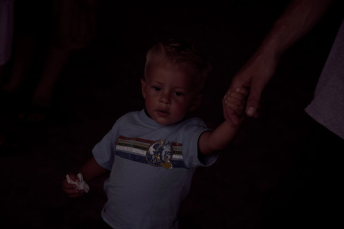
Here's the original, underexposed photo. Being relatively new to some of the semi-manual settings of my camera, I often make the same mistake of forgetting to change my settings when the light changes. I have dozens (if not hundreds) of this-would-be-a-great-picture-if-only-I'd-remembered-to-____________ type pictures. Not having the money for the benefit of Lightroom, I'm left to my own devices (ie. Gimp) in order to fix photos like this one.
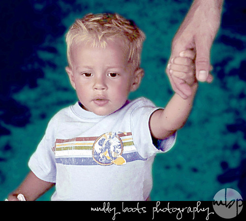
Here's my first attempt. In addition to lightening/sharpening/taking some of the read out, I decided to play a bit with the background color with this one. For no reason, really. I thought it looked groovy (like this wee man's surfer shirt) and like the ocean (that I imagine is what he's looking so intently at).
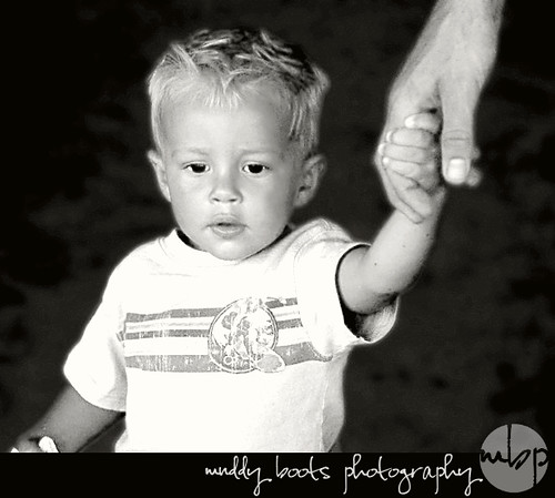
And a black and white edit. Cause things always look purdy in black and white. I added an slight sepia tone by adding an orange layer at, like, 3% opacity. Just to warm it up a bit. Cause beaches are warm. Logically.
So there you have it. What I spent my time on today between nursing, wiping eyes/noses/bums, nursing, rocking, nursing, designing my logo, nursing, nursing, nursing...
(While most people lose weight when they're sick, I'm pretty sure Andrew will have gained. He's been nursing like a newborn since last night. A feverish newborn. Poor babe.)
Speaking of the logo, what do you think? Better than on the lemonade stand pics? Thoughts? Opinions? Is it too pretentious??
fun! :-) and I like your logo -- let me go look at the lemonade stand pics right now . . . but i dont think it looks pretentious at all! :-)
ReplyDeleteYes, I like the logo (and there's no pretension in it)! Somehow, though, I'd like to see a little black & white illustration of boots with mud on them. Too literal? Just a thought.
ReplyDeleteI love the black and white photo, and I am definitely loving the logo!!
ReplyDeleteHey Amy! I love the logo, and I also like the one on the lemonade stand pics. Somehow the turquoise logo on the lemonade ones just "goes" with those specific pics. I guess I'm not much help, I like them both..
ReplyDelete-Sara
I like! They look awesome! I love Gimp!
ReplyDeletei agree, i like the logo WAY better! but who are you kidding, your middle name is pretentious! wait, then your initials would be APB and that is just weird!
ReplyDeleteAndrew is looking like a little boy and is adorable! I love the picture with the blue and B&W. The logo looks great--you can see it much better in the revised one.
ReplyDeleteLove ya, A. Dianne
I love your logo! ...And what you did with the picture! :)
ReplyDeleteLove
Elise
The logo is great! I think the playful font goes really well with the "muddy boots" text. Plus the watermark is very unobtrusive.
ReplyDeleteI can't believe the improvement you were able to get from Gimp. I've had it installed on my PC for a while but I've never really used it for more than cropping and brightening up the odd picture. I really have to get in there and learn how to use it properly.
the 1st edit is trippy, LOL but in a good way. The second one is my fav. Great edits.
ReplyDeletePlease check out mine:
www.crystalraephotography.blogspot.com
Really nice work, Amy! And FWIW I think this logo is *far* more professional than the previous one. It's easier to read, the font is as funky as you, and it really adds to the images. Hmmm, now you've got me thinking... do I have time to do this? Choosing a font for anything is the most agonizing process!!
ReplyDelete